
Custom Enamel Pins vs Printed Pins: Which Fits Your Logo?
A buyer sends the same logo to two suppliers. One redraws it with metal borders and solid color fields. The other proposes printing the gradients and small details. Both may be reasonable, but they are offering different visual results.

Should your logo use enamel or printing? Choose enamel when the design can be expressed as distinct color areas separated by metal and that outlined, dimensional look supports the brand. Consider printing when preserving gradients, very fine lines, small text or image-like detail matters more than visible metal divisions. If neither answer is clear, ask for two marked artwork interpretations before comparing prices.
Enamel translates the logo. Printing can reproduce more of it.
In a typical enamel-style layout, metal lines define and separate color-filled areas. Curves, lettering and negative spaces may need to be adjusted so the design can be made at the approved pin size. That translation can give a logo a strong, graphic character.
A printed construction can retain continuous color changes and details that do not need metal boundaries around every element. The quotation should still identify the actual printing and protective finish being proposed; “printed pin” is a broad description, not one universal specification.
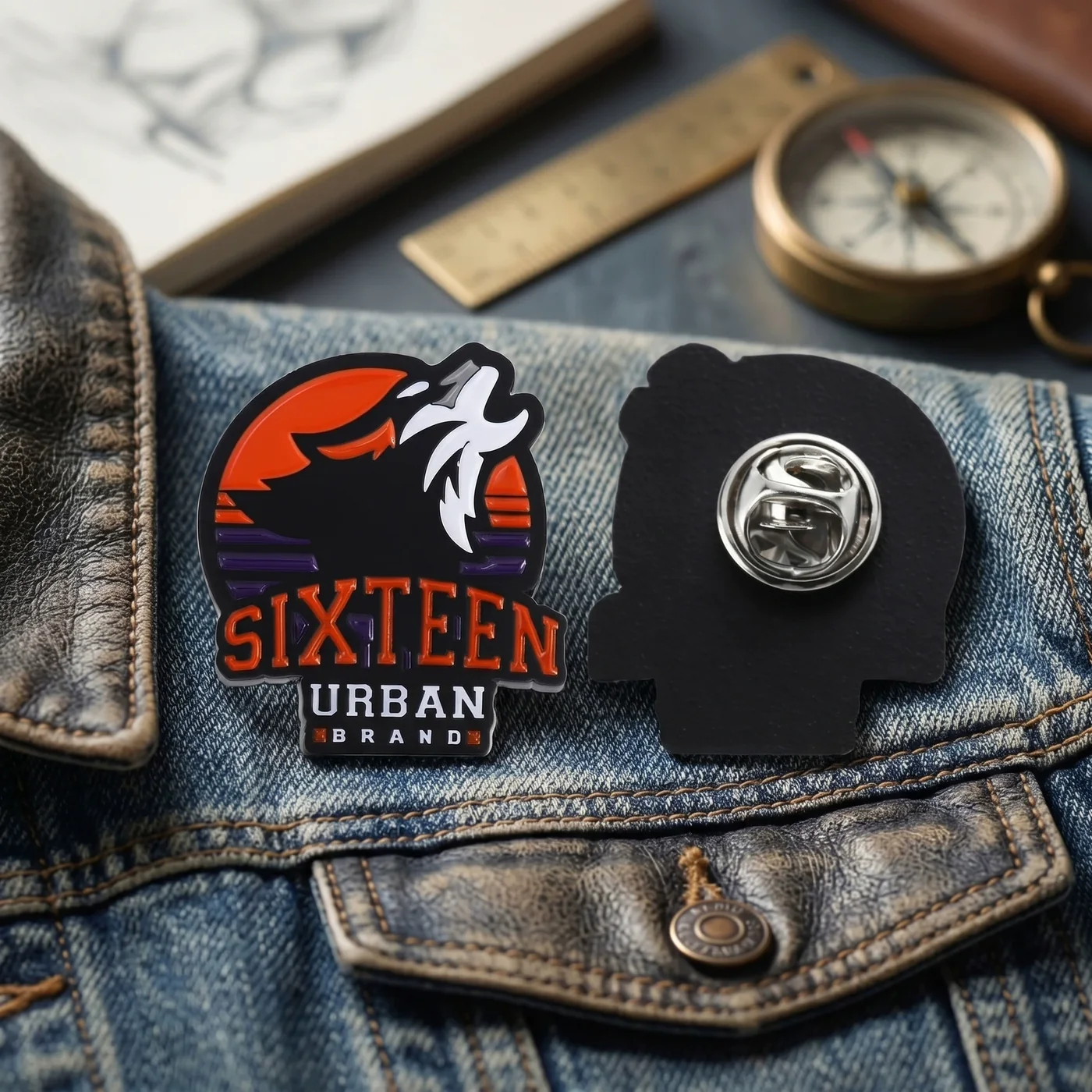
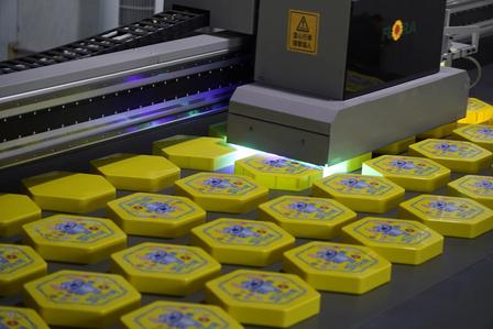
Start with what the logo cannot afford to lose.
| Artwork requirement | Enamel route | Printed route | What to approve |
|---|---|---|---|
| Flat brand colors | Well suited when colors can occupy separate bounded areas. | Can also reproduce flat colors without making metal lines part of the front design. | Color references, finish and the permitted visual difference between screen and product. |
| Gradients and shadows | Usually require simplification into solid regions or another proposed treatment. | Often the more direct route when continuous tonal change must remain. | A production-size proof and a physical sample if the tonal result is critical. |
| Tiny text or fine lines | May require enlarging, thickening or removing details. | May retain finer artwork, subject to the supplier’s confirmed limits and legibility at size. | Readability on the actual product, not only in an enlarged PDF. |
| Visible metal outlines | Can make the metal divisions a deliberate part of the identity. | May reduce the need for internal metal borders. | Where metal remains visible and how the outer edge is finished. |
| Tactile character | Offers a construction in which metal and filled areas visibly define the design. | Prioritizes the printed image; the surface treatment depends on the quoted specification. | A side view, surface description and sample rather than a front rendering alone. |
Do not let “production artwork” become an unapproved redesign.
When a supplier adapts artwork for enamel, ask for every change to remain visible. A simplified gradient, enlarged letter or added metal divider may be necessary for the proposed construction, but it also changes the logo. The brand owner should decide whether that interpretation is acceptable.
Compare the proposed pin at its physical size. Zooming in on a monitor can hide the real decision: whether a recipient can recognize and read the mark when the product is worn or handed out.
Ask the supplier: “Please show the original logo beside the production interpretation. Mark every merged color area, enlarged detail, removed element and added metal divider.”
Can a pin combine enamel and printing?
A supplier may propose printing selected details over or alongside color-filled areas. This can be useful when most of the badge benefits from an enamel-style structure but a small part of the logo needs detail that metal divisions cannot carry cleanly.
Treat this as a specific third option. Ask which elements are filled, which are printed, what surface or protective treatment is included, and how the hybrid result will be approved. Do not compare its price with a standard enamel quotation until the scope is aligned.
A Pantone reference does not make every surface look identical.
A screen, a printed ink area and a color fill interact with light differently. Metal finish and any clear surface layer can also change the visual impression. Use agreed color references to communicate intent, then define how the physical result will be reviewed.
If an exact brand presentation matters, request representative samples or a project sample under the agreed lighting and viewing conditions. Record whether approval concerns a named color reference, an accepted physical sample, or both.
Inspect the feature that drove the process choice.
- View at actual size. Check recognition, small text and the balance of visible metal.
- Compare with the approved proof. Confirm that the production method and every artwork revision match the agreed version.
- Check gradients and fine detail. For printed work, look for the transitions and small elements the buyer decided to preserve.
- Check boundaries and fill areas. For enamel work, inspect the geometry and the relationship between metal lines and colors.
- Review the complete item. Include the reverse, attachment and packaging rather than approving only the front face.
The inspection criteria should follow the agreed specification and order requirements. This guide does not assign universal line widths, color tolerances or print-resolution limits.
Ask suppliers to price the same visual outcome.
A low quotation may be based on a simplified logo, fewer colors, a different attachment or unassembled packaging. Before selecting a supplier, compare the artwork interpretation as carefully as the unit price.
Request separate options when the choice is still open: one enamel interpretation, one printed interpretation and, if relevant, one hybrid proposal. Each should state size, finish, attachment, packaging, sampling and any assumptions that affect the result.
Use our broader custom enamel pin purchasing guide to align the remaining order details.
Send the logo before choosing the process.
Planning custom logo pins for an event, uniform or retail program? Send the artwork, finished size and intended use. Identify any gradient, small text or brand element that must not be changed so the construction can be discussed against the actual design.
Scope and references
This article is a process-selection guide for buyers. It does not claim that one construction is universally more durable, premium or economical. Exact artwork limits and available hybrid methods depend on the supplier and approved specification. General attachment and production choices are also covered in our editorial policy. Product and process images are existing Extra Dream assets already published on this website.