
Visual specification guide
Choose the finish, relief and presentation as one system.
Compare plating, enamel, printing, relief structure, pin backings and packaging before approving your custom metal sample.
Use bright plating for clean reflectivity and vivid color, satin for controlled reflection, and antique finishes when relief and recessed detail need stronger contrast. Confirm the final direction on a physical sample because screens cannot reproduce metal tone and gloss consistently.
Finish & process explorer
See the choices before you specify them.
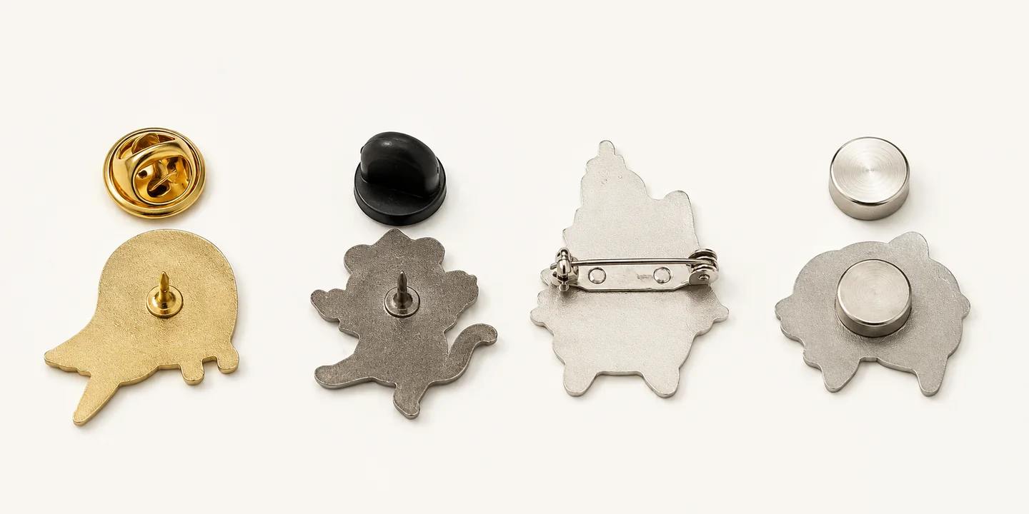
Switch between plating, color, relief, backings and packaging. Select any image to enlarge it; final tone, texture and fit are confirmed on the approved sample.
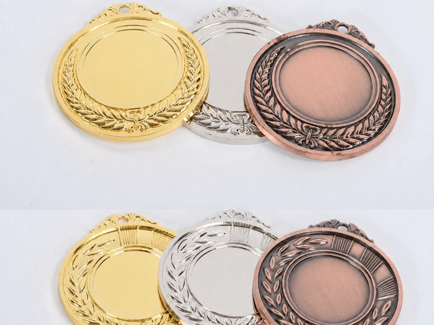

Shiny gold
Warm, reflective and formal.

Antique gold
Dark recesses reveal relief.
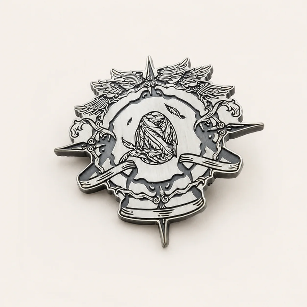
Shiny silver / nickel
Cool, crisp and highly reflective.

Antique silver
Bright edges over darkened detail.
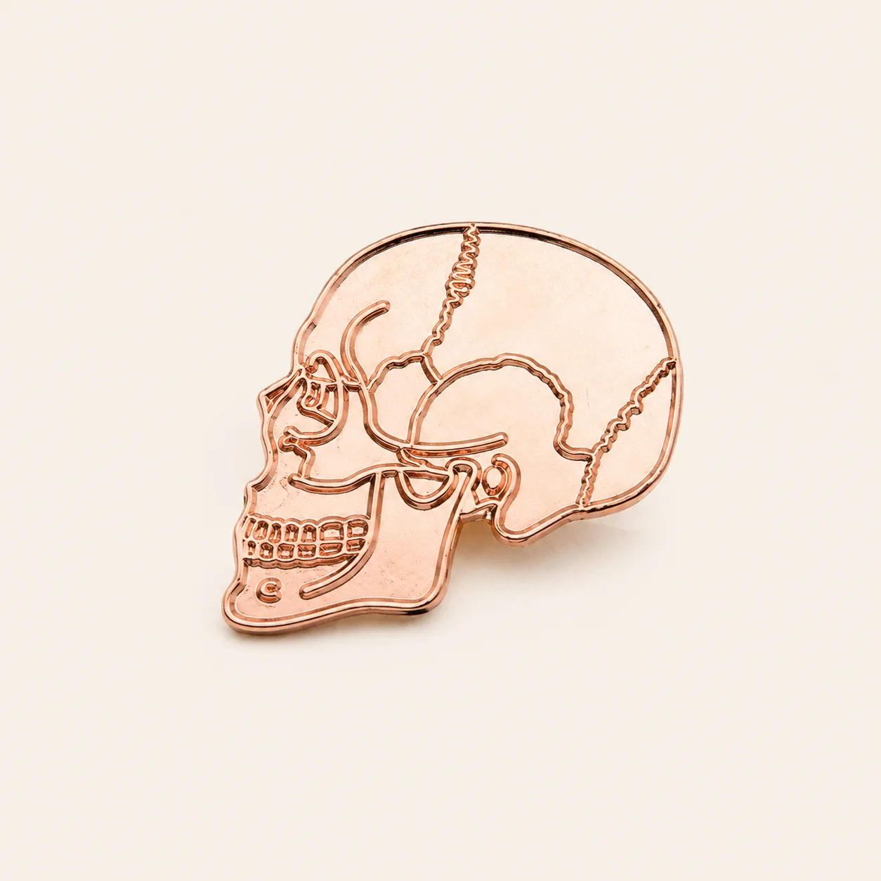
Rose gold / copper
A softer red-warm metal direction.
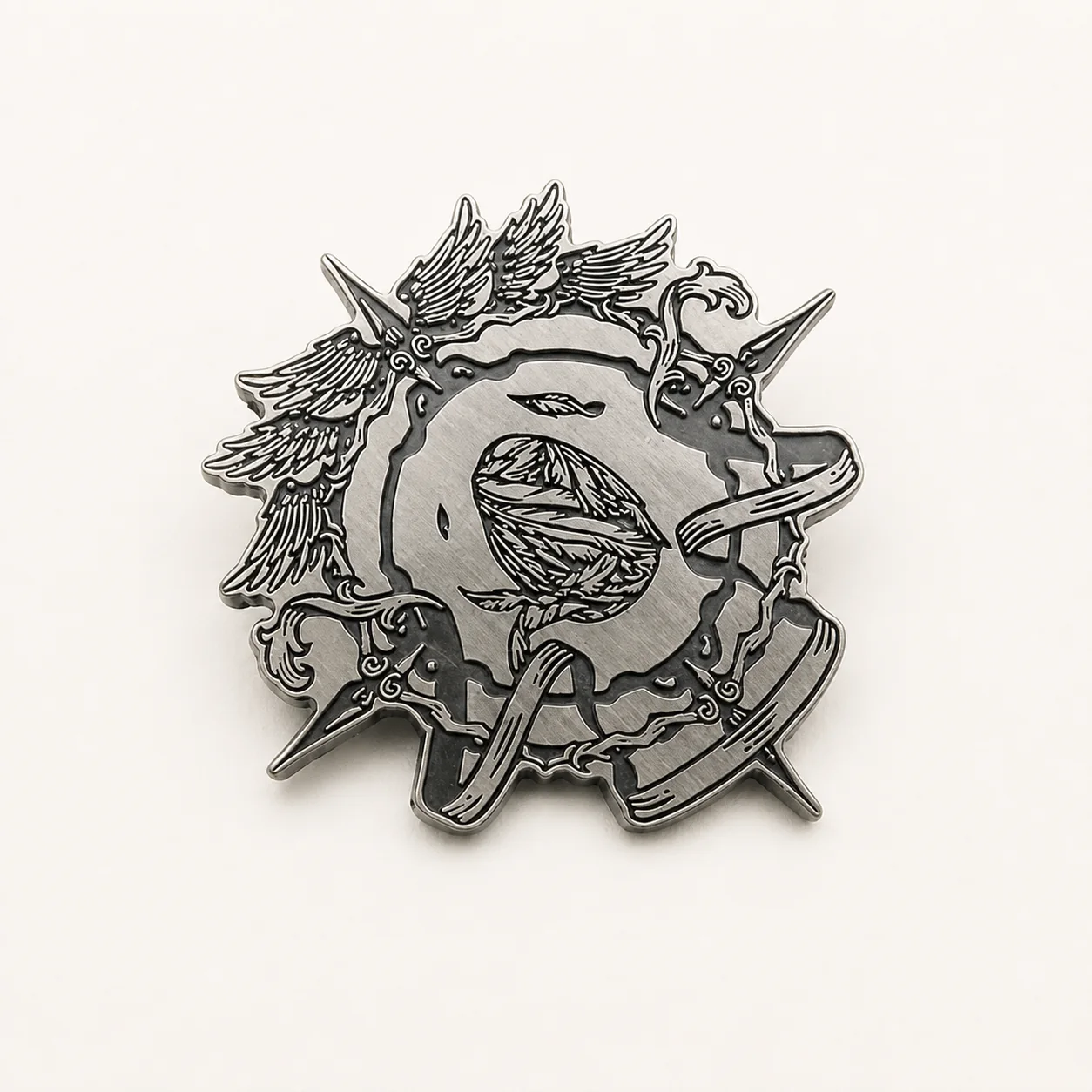
Black nickel / gunmetal
Modern contrast with restrained shine.

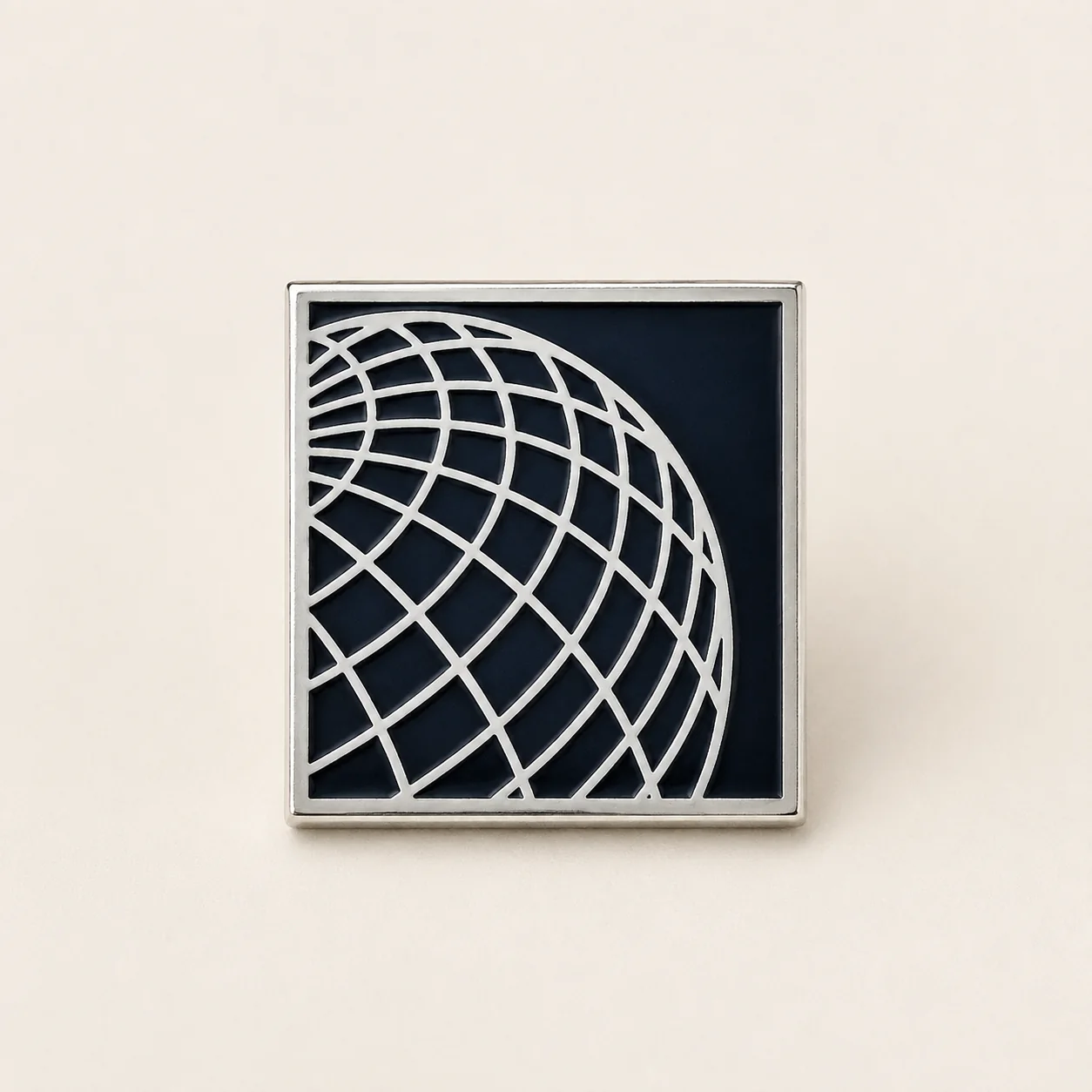
Soft enamel
Recessed color with tactile metal lines.
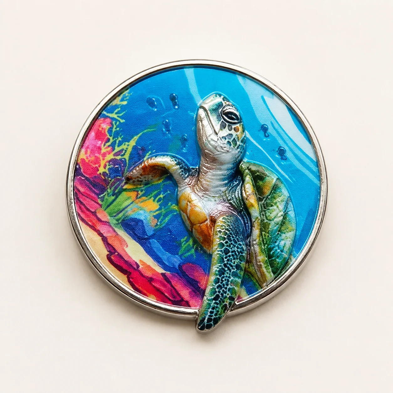
Hard enamel
A smooth, level surface after polishing.
UV printing
Useful for gradients and fine color detail.
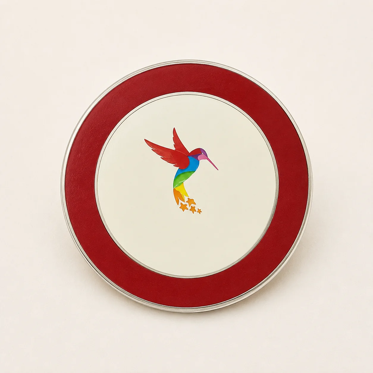
Screen printing
Crisp, simple graphics in defined colors.
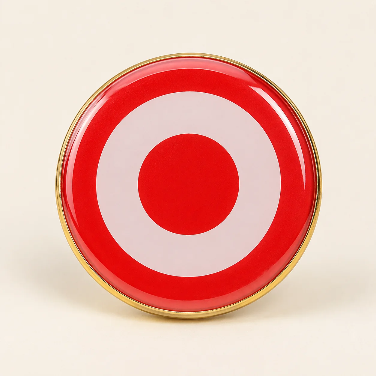
Clear epoxy
A glossy resin dome over printed artwork.
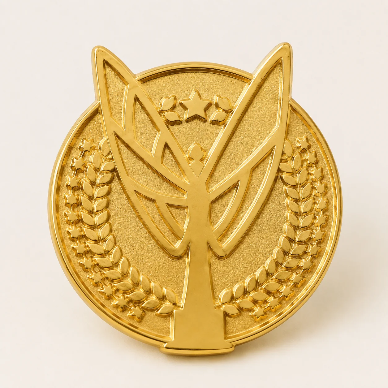
Metal only
Relief and texture carry the complete design.
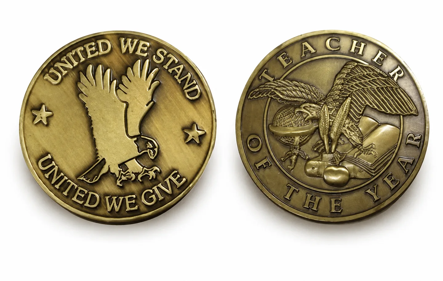
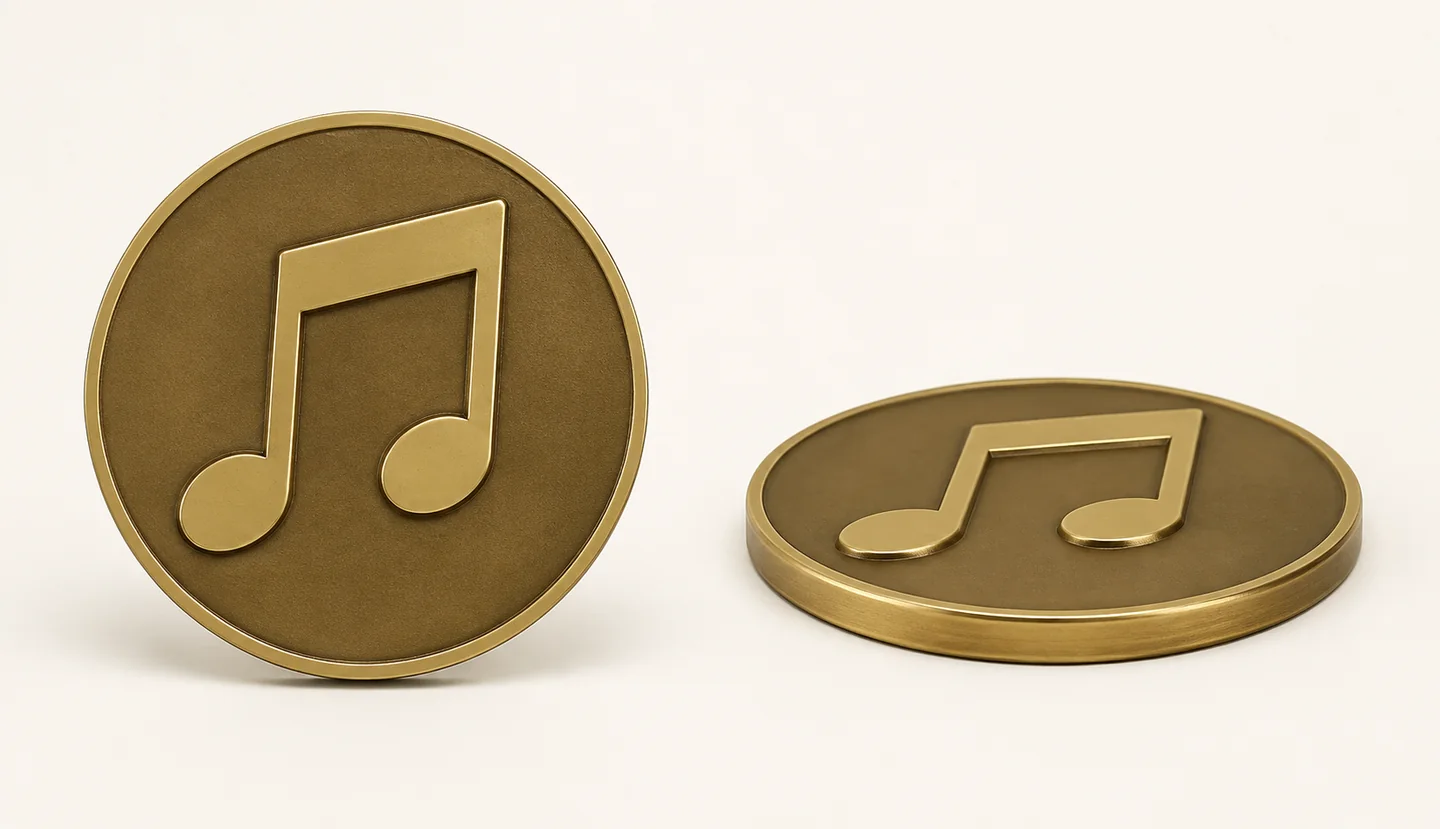
2D relief — front & side
Flat raised areas meet recessed fields at clear height changes.
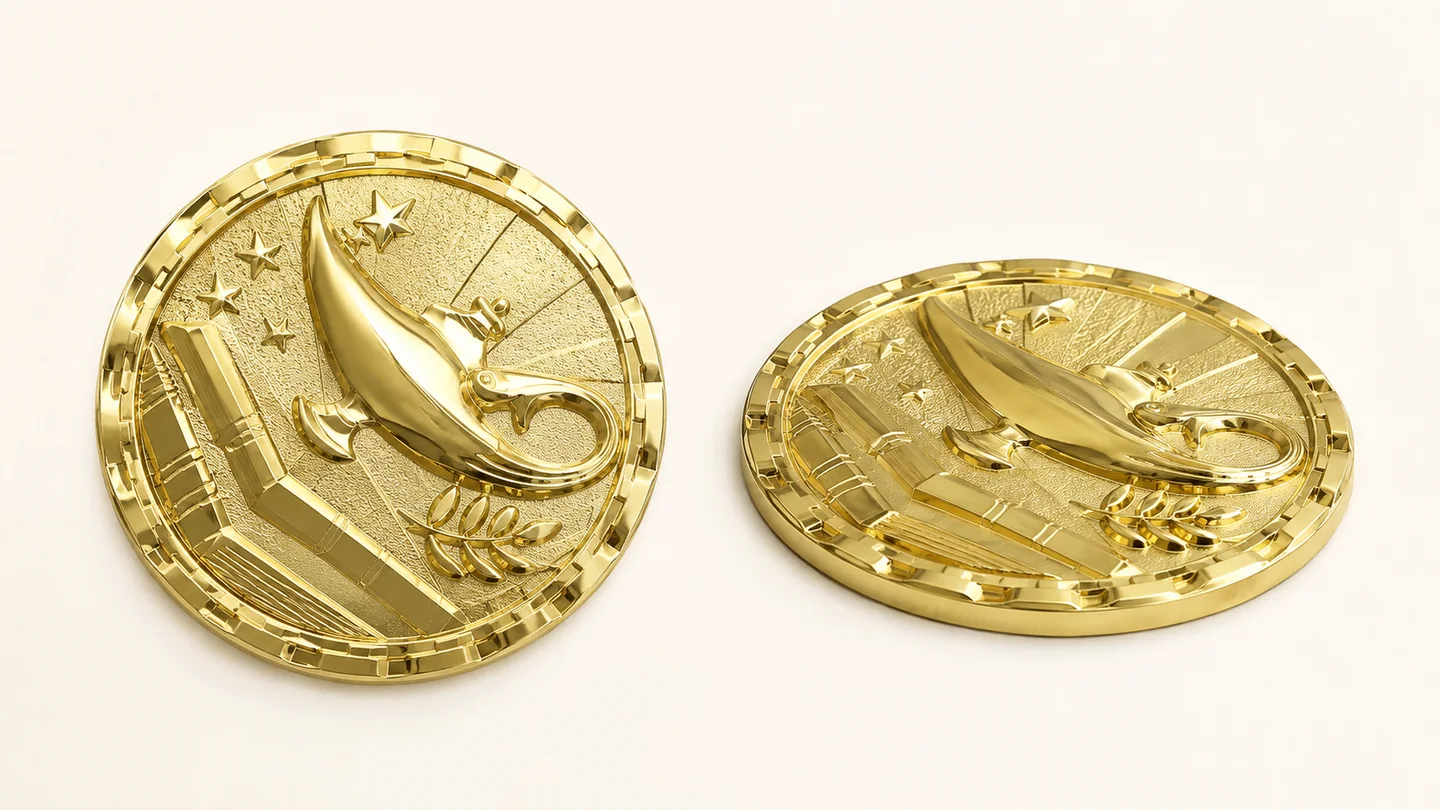
3D relief — front & side
Continuous curves use light and shadow to describe volume.
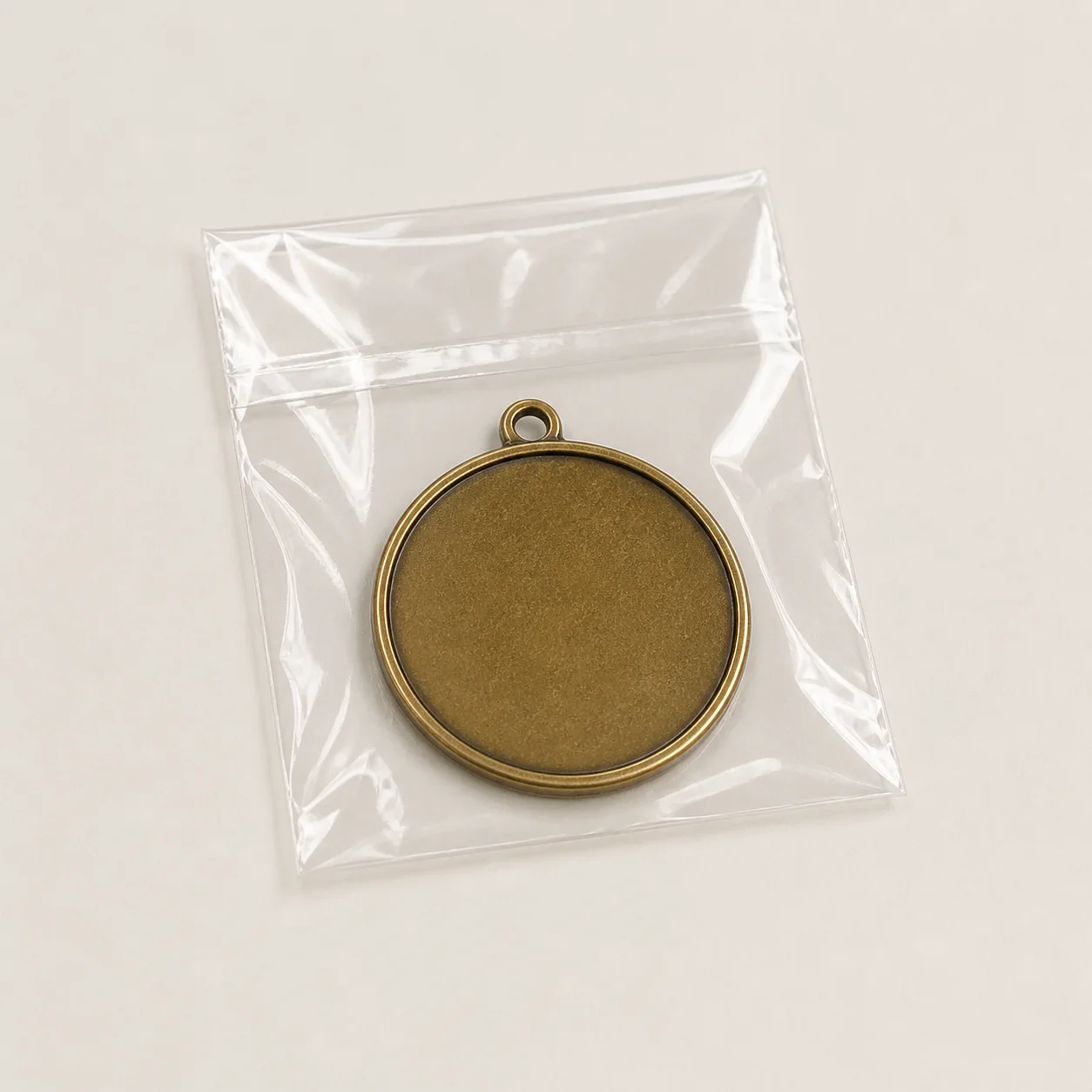
Self-seal OPP bag
Simple individual protection for bulk orders.
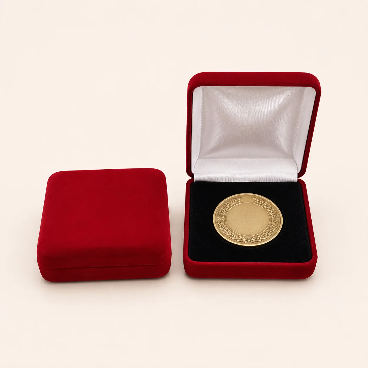
Velvet medal box
A compact hinged box for awards and gifts.
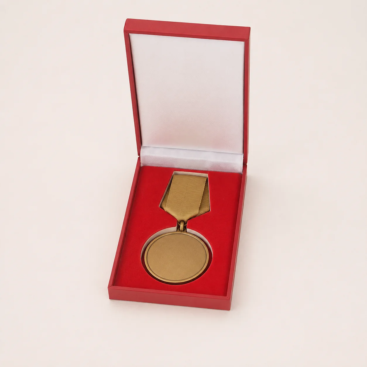
Presentation box
A fitted insert keeps the complete set aligned.
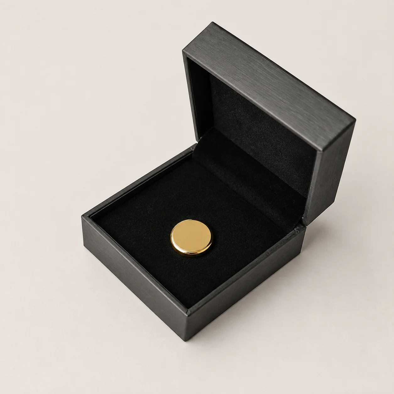
Rigid gift box
Strong structure with a fitted foam interior.
Plating color and surface finish are related but not identical
Buyers often request “gold,” “silver” or “bronze” as if each describes one fixed appearance. In practice, the result also depends on whether the surface is bright, satin, brushed or antique, how the relief is modeled and whether enamel or printing covers part of the metal.
The same design can look ceremonial in bright gold, technical in satin silver or historic in antique bronze. A good specification therefore describes the visual purpose, not only the plating name.
Bright finishes: clean reflection and strong color contrast
Bright gold, silver, nickel-like and copper-tone finishes reflect surrounding light. They create crisp separation from enamel color and can make simple shapes feel polished and formal.
Bright finishes are useful for:
- Podium medals and formal recognition
- Brand colors that need a clean metal border
- Simple relief with large polished areas
- Products photographed under controlled lighting
Highly reflective surfaces also reveal handling marks and changing reflections more easily. If the product will be carried frequently or photographed in many environments, consider whether satin or selective texture would create a more consistent appearance.
Satin and matte directions: quieter reflection
A satin or matte direction reduces mirror-like glare. It can make typography and relief easier to read under varied lighting while giving the product a controlled, contemporary feel.
This direction is often effective for corporate awards, technical emblems, architectural designs and products where understated presentation matters. It can also create useful contrast when selected raised areas remain brighter than the background.
Antique finishes: contrast that reveals relief
An antique treatment darkens recesses and leaves raised areas more visible. That contrast helps fine relief, borders and textured backgrounds remain legible without adding many enamel colors.
Antique finishes are common on challenge coins, commemorative pieces and heritage-inspired awards because the surface communicates depth and permanence. They are also practical for designs with portraits, buildings, symbols or layered typography.
The darkened areas are intentional. The goal is to create controlled contrast between raised and recessed metal so the design can be read clearly.
How enamel and printed color interact with plating
Metal finish forms the border around color areas and changes how those colors are perceived. Bright silver can make cool colors feel cleaner; warm gold can shift the overall palette; antique backgrounds can make light colors stand forward.
Before sampling, check:
- Whether each color area is large enough for the selected process
- Whether thin metal borders separate neighboring colors
- How small text will be produced and read
- Whether the metal tone supports or competes with the brand palette
- Whether print is required for gradients or photographic details
For artwork preparation, use the custom medal design guide.
Dual finishes and selective contrast
A dual-plated or selectively polished design can separate important elements without filling every area with color. For example, a warm central emblem can contrast with a silver border, or raised lettering can remain bright against a darker field.
These options require clear artwork and process planning. More finish boundaries can increase production complexity, so they should support the visual hierarchy rather than exist only to add decoration.
Choose the finish for the product’s real environment
| Use | Useful direction | Reason |
|---|---|---|
| Race finisher medal | Bright or satin plating with enamel | Visible at a distance and during photography |
| Detailed challenge coin | Antique or controlled satin finish | Relief remains readable in the hand |
| Corporate award | Bright or satin finish with restrained color | Formal, consistent presentation |
| Enamel pin | Clean bright border or selected dark plating | Defines small color areas and outlines |
| Souvenir collectible | Finish matched to story and display lighting | Supports the destination or heritage theme |
Why physical sample approval matters
A digital rendering is a communication tool, not a perfect simulation of plated metal. Monitor calibration, room lighting and image compression all change perceived tone. A physical sample lets the buyer review reflectivity, relief, enamel interaction, handling and packaging together.
When reviewing the sample, use one consolidated checklist:
- Overall metal tone and level of reflection
- Contrast between raised and recessed areas
- Readability of small text
- Enamel or printed color placement
- Front and back orientation
- Ribbon, attachment and package compatibility
How to request the right finish in a quotation
Send the artwork, product type, dimensions, quantity and intended use. Include a reference image if you are trying to match a visual direction, but explain what you like about it: warmth, gloss, contrast, aged appearance or color relationship.
Avoid relying only on names such as “old gold” or “premium silver,” because naming varies. The approved artwork, reference, written specification and physical sample should work together as the controlled standard.
Finish FAQ
Questions buyers ask before sampling.
What is an antique finish?
An antique finish darkens recessed areas and leaves raised areas more visible, increasing contrast and emphasizing relief.
Is shiny plating always the most premium option?
No. Bright plating can look clean and vivid, while satin or antique finishes may communicate detail, seriousness or texture more effectively.
Can enamel be combined with antique plating?
Yes, when the artwork and selected process are suitable. Review the color palette against the darker recessed areas and approve a physical sample.
Should the finish be approved from a screen image?
Digital renderings help communicate direction, but a physical sample is the best reference for tone, gloss, relief and color interaction.