
Commemorative & challenge coin design
Custom Coin Design: Layout, Text & Relief
Plan your coin around its purpose, two clear faces and details that work at actual size. Follow a real employee-recognition project from a crowded idea to a readable design.

Start with the purpose and recipient. Give the front and reverse distinct roles, arrange text and imagery at the intended size, then confirm relief, colour and a physical sample. You can begin with a logo, approved wording and reference images; a complete production drawing is not required to start the discussion.
1. Decide what the recipient should remember
A project-completion award, company anniversary, service milestone and local heritage coin need different focal points. Before arranging the artwork, answer three questions: who will receive the coin, why is it being presented, and what should it help them remember?
A project award may need the organisation’s identity, project name and completion year. A tourism keepsake may depend on a recognisable landmark or local symbol. Establish that purpose before deciding which image deserves the centre and which information belongs on the reverse or an accompanying card.
Separate required content from supporting material. Confirm official names, logos, dates and mandatory wording with the customer first. Then choose photographs, textures and decoration around that content.
2. Give the front and reverse different jobs
For corporate recognition, a useful approach is to establish the organisation on one face and explain the occasion on the other. Turning the coin should reveal another part of the story.
On a small screen, swipe the table sideways to compare all columns.
| Design role | Possible content | Review question |
|---|---|---|
| Identity and recognition | Company logo, organisation emblem, portrait or landmark | Can the main subject be recognised before the small text is read? |
| Occasion and context | Project name, anniversary, completion year, short acknowledgement or theme symbol | Does this face explain why the coin was made and presented? |
| Supporting explanation | Longer background, full acknowledgements or series information | Would an information card or packaging make this easier to read? |
This is a planning approach, not a fixed rule about which side must carry a logo. A portrait or landmark can lead the front while the reverse carries the organisation and context. Keep the typography, border and overall style consistent across both faces.
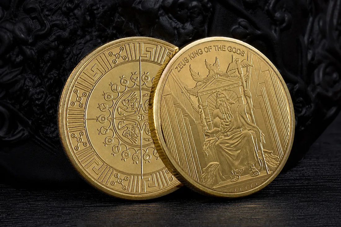
3. A project coin: from crowded references to two clear faces
An energy company in Kazakhstan wanted commemorative coins to recognise key employees after a project was completed. The initial brief put the company logo on the front and a collection of equipment, oilfield and pipeline photographs on the reverse, together with a completion date and a long acknowledgement in Kazakh.
Each element mattered to the project, but fitting them into the coin left text, photographs and machinery details competing for space. We discussed what each face needed to communicate, then reorganised the artwork.
Swipe sideways to compare the design changes.
| Area | Design adopted | Purpose of the change |
|---|---|---|
| Front | Main company logo, project name around the border and more open space | Give the organisation a clear, formal identity |
| Reverse motif | A simplified impeller motif as the principal relief | Concentrate the energy-project theme in one recognisable symbol |
| Reverse wording and images | Project name and completion year, with the long text shortened and small supporting images removed | Give essential information enough room without reducing it to tiny lettering |
| Artwork preparation | Complex photographic references reworked into defined vector outlines | Make the shapes, lines and details to retain easier to review |
The customer approved the revised layout. The sample showed clear relief and a distinct hierarchy on both faces. The coins were subsequently distributed to employees, with positive feedback reported: the design felt formal and worked well as a keepsake of the completed project.
The design retained the company’s identity and the project’s meaning. Instead of giving every equipment reference its own small space, a single distilled motif carried the theme and left room for readable text and relief.
4. Use photographs as references, then plan the relief
Light, materials and camera angle create the shading in a photograph. Relief expresses shape through raised and recessed metal. Before translating a photograph into a coin, identify the outlines, structures and layers that matter, along with background details that can be removed.
A simplified symbol, as used in the project above, can be prepared as a clear vector outline. A portrait, building or curved subject may also need a sculpted relief model so that its important features can be reviewed. A vector outline defines shapes and layout; it does not automatically create a continuous 3D surface.
The U.S. Mint’s sculpting overview illustrates the separate step from drawings and photographic references to a three-dimensional model. For your own brief, mark the essential subject and identify which parts of a reference image are background only.
5. Place small text where it can be read
Small lettering is harder to read when squeezed into narrow recesses, dense texture or an area with pronounced relief. For longer names, consider a more open border or dedicated text area, with space between letters and between text and imagery.
Print the artwork at the intended diameter and check complete names, years and punctuation. For multilingual wording, have the customer approve the characters, spelling and line breaks. Keep official project names intact unless the customer agrees to a change.
If the wording is unclear at actual size, compare these options:
- Move the text to a more open area.
- Adjust the letter strokes, spacing and distance from other details.
- Shorten optional wording with the customer’s approval.
- If the full wording must remain, reconsider the size or use an accompanying information card.
These are choices to discuss, rather than a reason to remove required wording. For further approval checks, see the challenge coin design mistakes guide.
6. Leave room for the main subject
Open space on a metal coin can be a flat background; it does not have to be white. It separates the logo, lettering and relief so their hierarchy is easier to read. The Royal Australian Mint’s coin anatomy guide calls the flat background behind a design the field.
Leaving space means fewer supporting elements can occupy the coin. If every symbol is required, discuss its priority, placement across the two faces or use on an accompanying item before removing it.
At actual size, look for the main subject first, essential wording second and decoration last. If everything appears equally prominent, revise the scale and spacing. Dense details also create more features to resolve during modelling and tooling; ask the supplier to mark areas that need simplifying or adjusting.
7. Choose relief, colour and packaging around the purpose
Logos, lettering and graphic shapes can be evaluated as clearly defined relief levels. Portraits, buildings and curved subjects need particular attention to gradual changes in depth. Both approaches can appear in one design, provided the main subject and text remain clear.
Review colour and the metal finish together. Bright surfaces, antique contrast and selected colour areas create different visual directions. Decide whether the priority is brand-colour recognition, the metal relief or a balance of both, then compare the actual samples. The metal finish guide can help you prepare that discussion.
Packaging should fit the handover. For event distribution, compare options that protect the coins and make counting and handing them out practical. Formal recognition may call for a fitted presentation package. An information card can carry a longer project story while keeping the coin itself uncluttered.
8. Review the drawing, relief plan and physical sample
Swipe sideways to view the checks at each stage.
| Stage | What to check | What to retain |
|---|---|---|
| Layout and wording | Hierarchy on both faces, logo, project name, dates and arrangement at actual size | Approved artwork version and original wording file |
| Relief and process plan | Key outlines, relief levels, fine lines, lettering position, finish and colour coverage | Relevant model or process notes, including agreed detail changes |
| Physical sample | Legibility, relief, metal tone, feel, front-to-reverse orientation and packaging fit | Approved sample, photographs and confirmation record |
The drawing establishes the arrangement and wording. A model helps resolve sculpted form, while a physical sample shows actual size, reflections and feel. Follow the challenge coin manufacturing process for the next steps from design approval into production.
9. Prepare a one-page design brief
We are planning a commemorative coin for [purpose], to be presented to [recipients].
Required content includes [logo, official names, dates, central subject and wording]. References are attached. Please emphasise [main subject]; [other material] is available as supporting inspiration.
The front should communicate [identity or theme], and the reverse should add [occasion, year or context]. Proposed dimensions are [diameter and thickness / recommendation requested], with [quantity per design].
We would like [relief, colour and finish direction]. Packaging will be used for [event distribution / formal recognition / other]. The coins need to arrive at [destination] by [date].
Please recommend a workable layout and identify any details that need simplifying or adjusting for our approval.
Extra Dream’s standard minimum is 500 pieces per design. Send the purpose, references, quantity and timing so we can discuss a suitable layout and production specification. Explore custom commemorative coins or discuss your coin design.
Frequently asked questions
Does the company logo have to go on the front?
No. Corporate recognition often separates organisational identity from the occasion, but a portrait, landmark or event can lead the front. Give each face a clear role and make the two sides work together.
Can I start with photographs rather than vector files?
Yes. Use photographs to explain the subject and important structures, then agree which outlines, wording and relief modelling are needed. Do not assume every background detail and shadow must become a metal feature.
Will a larger diameter solve a crowded design?
A larger size is one option, but first review the hierarchy and text placement. Revised spacing, shorter optional wording or an information card may suit the project better than simply enlarging the coin.
Does a commemorative coin need complex 3D relief?
No. A clear logo or symbol can communicate the subject and its meaning. Choose continuous sculpted surfaces where they help the actual design, and assess the sample and budget before deciding.